When I first got into the graphics field, we didn’t call it “graphic design,” we called it “commercial art” because back then, the technology was a tool to express the design; one went to art school which would just as readily teach oil painting and sculpture as it would teach advertising psychology and photo retouching. Today’s graphic artists are technological wunderkinds but their training and experience rarely venture into artistic layout, balance, typography, and other elements of design that would make an project a powerful and successful one. Truly, there is no school like the old school.
And that is what I bring to the table with my designs. Most of the projects I work on these days are publications and books; laying out page after page of text with illustrations and eye-catching covers. Every bit of my training and decades of experience are poured into each and every one and I will bring that expertise to bear on your project be it a novel, a periodic magazine, advertising campaign, package design or…whatever it is you may need.
Another shift in the paradigm of the design field is the easy use of the internet. Once I would have to meet with a client across a conference table and map out all of the details of a proposed project and then have them return to see mocked-up proofs. Today everything is digital. I have many clients that I’ve never met face to face who rely on me to meet their deadlines and produce award-winning work for their businesses, events and publications.
*****
Magazine & Periodicals
Layout and Design
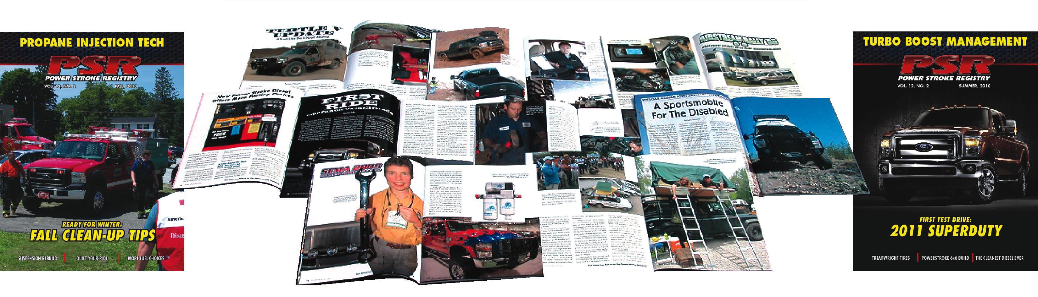
For over twenty years I’ve been working with a few different titles of periodical magazines for a couple of different publishers. Typically, their writers would dump text files and photos on me (by deadline, hopefully) and my art direction would translate a sea of paper and computer files into high-quality, bullet-proof designs that go to press on time and without drama. These are the things that magazine publishers and their advertisers want and that is what I deliver.
Over the years, my magazine and periodical designs have garnered three Communicator Awards for excellence.
 As the magazine business has ridden a pendulum that has swung toward the on-line web-based world and mostly abandoned the print world, that pendulum has swung back again and the magazines that I worked with rode it to keep up with the technology and the shifting styles that have resulted.
Many such magazines have started out as kitchen-table layout projects (maybe yours?) but today’s expectations are far higher and if you are a small-run publisher, particularly a “buff-book” publisher or club magazine, my services are precisely what you need. Not only do I handle the layout and design and all the art direction, but also work as liaison with printers and can help with contract negotiations when the need arises.
The ink-and-paper periodical industry is enjoying a resurgence. Is your publication ready to take advantage of that? Let’s talk.
*****
Photo Manipulation
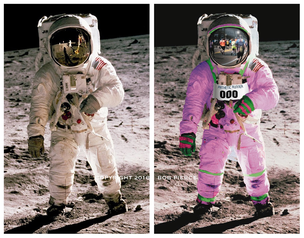
For virtually every project these days, special images need to be created. Most folks wouldn’t think of the possibilities of what could be done in PhotoShop by a professional until they see it. Just putting a snapshot on a book cover or promotional piece is all well and fine but how much more eye-catching would it be with some creative attention. Here are a few examples of some “before” and “after” images that have been used on various projects recently.
Obviously, these images have had a ton of work done on them. Cutting, re-configuring various elements. The space suit was colored to look more like a running suit for the cover of a book for marathon runners. I added the number bib to the front of the suit and, if you look closely, you can see the scene of the marathon runners ahead reflected in the visor.
Obviously, these images have had a ton of work done on them. Cutting, re-configuring various elements. The space suit was colored to look more like a running suit for the cover of a book for marathon runners. I added the number bib to the front of the suit and, if you look closely, you can see the scene of the marathon runners ahead reflected in the visor.
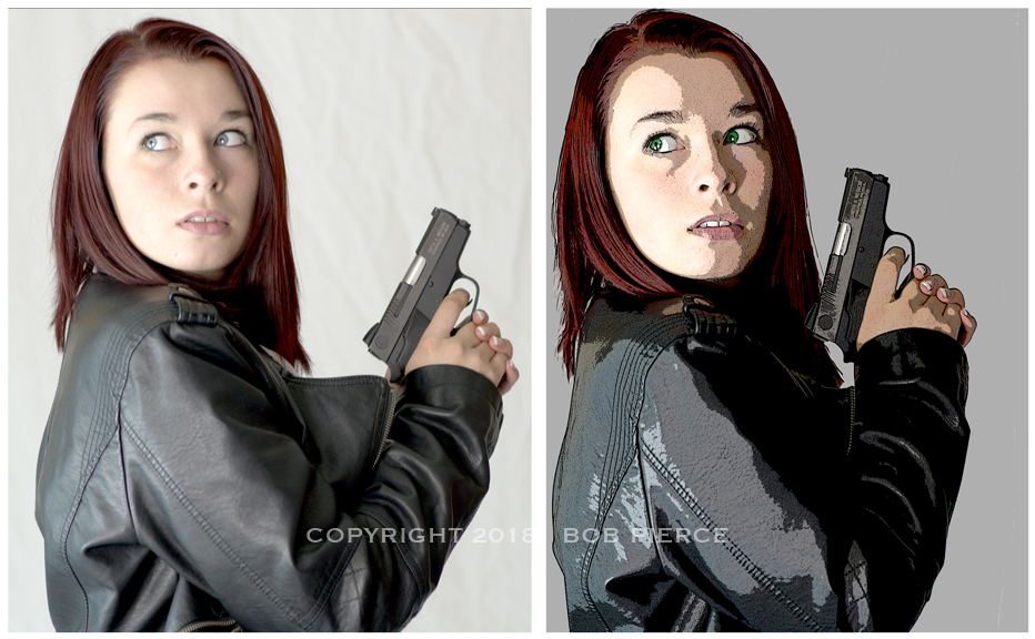
The girl is from the cover of my book “Ascention,” the raw photo from the photographer is on the left untouched. Her hair was red but not red enough, I added color and also changed her eyes to a brilliant green. The image was then processed with a couple of different filters to create the final image that I used for the book and all of the promotional materials that went with it.
Sometimes the project doesn’t require quite so much creative alterations but just a few fun alterations.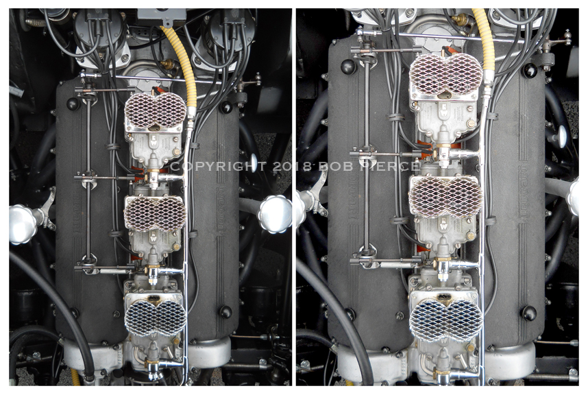
The vintage Ferrari engine was an interesting project. The photo was shot directly overhead. To be used for a CD cover, it needed to be perfectly symmetrical and square. In PhotoShop, the image was distorted from what I started out with (on the left). Let’s face it, even the most talented and well-equipped photographer can’t be sure to get the camera perfectly centered and paralell to the image when he’s leaning over the fender trying not to actually touch the paint with his belly. Trust me. The photo was also enhanced to bring out some more of the detail, as well.
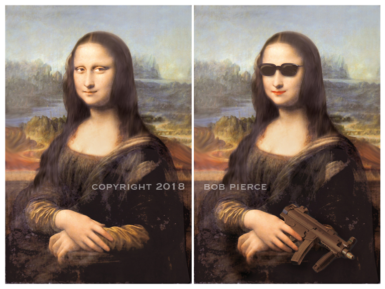
It’s hard to say that one could even dare to suggest that they could improve on Leaonardo DaVinci, but for my book “Pieces,” I needed to use the master’s painting (since it’s central to the story line) but make it say more. By adding the Roy Orbison shades and a sub-machine gun, it really did. The shades were drawn in a drawing program and inserted. The machine gun was lifted from a photo from a different photo session and color-shifted to have the same warm tones of browns and beiges that the painting had and then blurred to give it a softer look. Once pasted in place, the hand was cut and lifted from a copy of the original photo file and set in place. Finally some shading and shadows and one can hardly tell that Leonardo himself hadn’t painted her just like that. Though it’s obvious that the Mona Lisa did not have bright red lipstick, purple streaks in her hair and a machine gun, it’s still important sometimes to make the alterations – even really heroic ones – appear as if no alterations had been done at all.
And sometimes that’s just the ticket. Sometimes we just need to give the camera’s eye a little help.
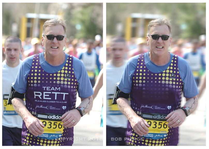
For his next book, the author wanted to use this photo of himself running in the Boston Marathon on the cover. It’s not a bad image as it stands but the background is a bit busy and distracting. I selected out everything behind the foreground runner and motion-blurred it and cut the contrast down a bit. Again, don’t want to make it look like it was fooled around with, it wants to still appear natural. The book cover will have a transparent band going across the middle of the image with the title lettering on top of it and the “Team Rett” lettering was way too bold and competing even with a ghosted band so it was airbrushed out and the fading yellow spots duplicated and extended down into the blank space. Also, the bright white “adidas” logo was darkened to avoid conflict with the title. If one did not have the original photo to compare against, one would never know that the finished product was messed with.
So what sort of project do you have in mind? Is your book in need of a dynamite, eye-grabbing cover and you need to use some sort of image and just can’t make it happen? Well, I probably can. I’ve done hundreds of PhotoShop manipulations like these for books, magazines and advertising and I know I can make it happen for you, too.
*****
Yeah, I Can Do That
 In addition to the specialties that I work in, my studio is known as a “can-do” operation and so I have produced all sorts of projects: Trade show display booths, posters, packaging, point-of-purchase displays, logos, signs, graphics for apparel, vehicle wraps, etc., etc., etc.
Bottom line is, if you have anything that you need designed and you want it to look professional, to be effective and at a reasonable cost, drop me an e-mail. I’m happy to work up free estimates and even send you some larger, higher-resolution samples than these pixelated thumbnails on this page so that you can get a better look at what I can do for you. Let me hear from you.
All images on this website are copyrighted by Bob Pierce and cannot be used or duplicated without prior written permission.